The Art of Minimalism: Logo Design Tips for Modern Businesses


Understanding Minimalism in Logo Design
Minimalism in logo design is more than just a trend; it's a powerful approach that focuses on simplicity and clarity. A minimalist logo is not only aesthetically pleasing but also communicates the essence of a brand with precision. By stripping away unnecessary elements, designers can create logos that are timeless and versatile across various platforms.
In a world overflowing with information, a minimalist logo stands out by being uncluttered and direct. It captures attention quickly, which is essential in today's fast-paced digital landscape. The art of minimalism revolves around finding the perfect balance between simplicity and effective communication.

Principles of Minimalist Logo Design
The key principles of minimalist design include simplicity, clarity, and functionality. A minimalist logo should be easily recognizable and memorable. To achieve this, designers often rely on basic shapes, limited color palettes, and clean lines. This approach ensures that the logo remains effective at different sizes and on various mediums.
Color plays a significant role in minimalist design. Opting for a monochromatic or limited color scheme can enhance the logo's impact while ensuring it doesn't overwhelm the viewer. Additionally, choosing colors that align with the brand's identity reinforces the message being conveyed.
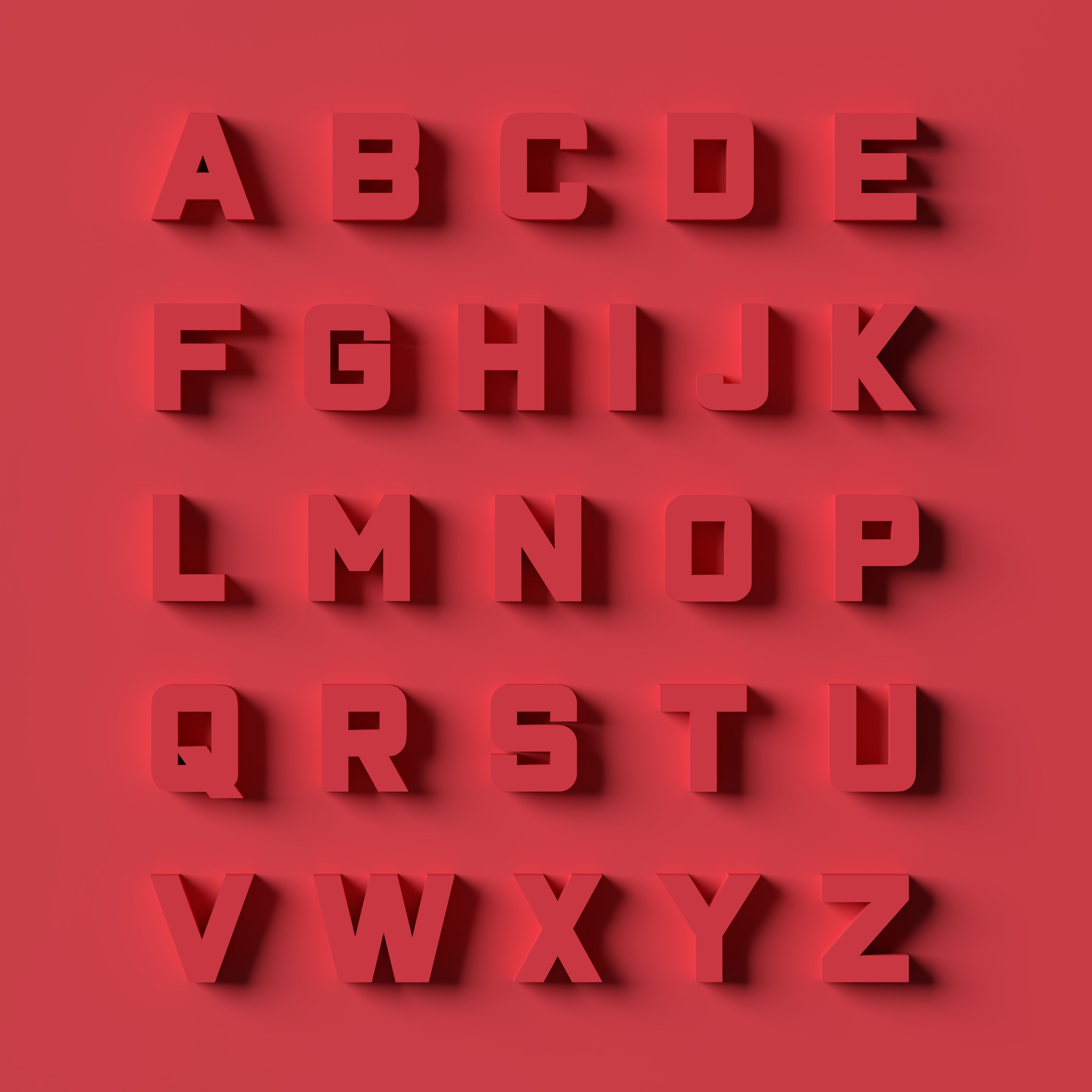
Focus on Typography
Typography is a crucial element in minimalist logo design. Selecting the right typeface can make or break the design. Minimalist logos often use sans-serif fonts due to their clean and modern appearance. It's important to ensure that the font complements the overall design and contributes to its readability and uniqueness.
The Role of Negative Space
Negative space, or the empty space surrounding and between the elements of a design, is a powerful tool in minimalist logo design. It allows designers to create visual interest and depth without adding clutter. By cleverly utilizing negative space, logos can convey multiple meanings or hidden messages, adding an extra layer of intrigue.
An excellent example of effective negative space is the FedEx logo, where the space between the "E" and "x" forms an arrow, symbolizing speed and forward movement. This clever use of negative space makes the logo not only memorable but also meaningful.
Timelessness Over Trends
While it's tempting to follow design trends, minimalism in logo design focuses on creating timeless pieces that won't quickly become outdated. A well-crafted minimalist logo should endure changes in style and technology, maintaining its relevance over time.

Investing in a minimalist logo can be a strategic move for modern businesses looking to establish a strong brand identity. By adhering to the principles of simplicity, clarity, and functionality, companies can create logos that are both impactful and enduring.
Ultimately, the art of minimalism in logo design lies in its ability to convey complex ideas through simplicity. By focusing on essential elements and eliminating distractions, minimalist logos effectively communicate a brand's core values and make a lasting impression.